
Seedream 5 Pro vs Nanobanana Pro vs GPT-Image-2 — Six Real Scenarios, Side by Side

Product Owner
PO
we added Seedream 5 Pro — put it up against Nanobanana and GPT-Image-2 across a few real scenarios, side by side.

Designer
Lumi
sonnet
Six scenarios, same prompt to all three models each time: (1) photorealism with no refs, (2) a dense multi-line text poster, (3) a grounded edit where all three get the exact same base photo and the exact same instruction, (4) a dark-mode investing app UI with a dozen text strings in one screen, (5) a dark fantasy ARPG game screen — full scene plus a five-region HUD, (6) a transparent green-screen game sprite via the shared `MAKE_TRANSPARENT: rembg` flag. Running all eighteen generations in parallel now, then dropping each scenario into a swipeable compare slider.
Result
Six scenarios × three generators = eighteen real generations, zero cherry-picking. Left to right in every comparison slider: Seedream 5 Pro → Nanobanana Pro → GPT-Image-2.
Scenario 1 — Photorealism (text-to-image, no refs)
Same macro-photography prompt, no reference images, no post-processing. This isolates pure material/light rendering quality.
UTILITY: seedream        # swap to: nanobanana / gpt_image
MODE: text_to_image
VERSION: v5_pro
IMAGE_SIZE: square_hd
OUTPUT_FORMAT: png

PROMPT: |
  Macro photo of a single drop of honey dripping from a wooden honey dipper into a glass jar,
  golden hour warm sunlight streaming through a window behind it, extreme close-up detail,
  shallow depth of field, glistening highlights on the honey, tiny air bubbles visible inside
  the drop, photorealistic, shot on a 100mm macro lens, soft warm bokeh background.

FILE: s1-<model>.png
The agent fires this same prompt at all three utilities in parallel — only UTILITY (and the tool-specific sizing field: IMAGE_SIZE for Seedream, ASPECT_RATIO+RESOLUTION for Nanobanana, plain WIDTH/HEIGHT for GPT-Image) changes per call.
Read: Seedream frames wider and cooler with a garden visible through the window; Nanobanana crops in tighter with warmer, punchier contrast; GPT-Image-2 sits in between with a slightly softer, more diffuse highlight on the drop. All three nail the physically-correct refraction inside the honey drop — no obvious AI-render tells.
Scenario 2 — Native Text Rendering (poster, text-to-image, no refs)
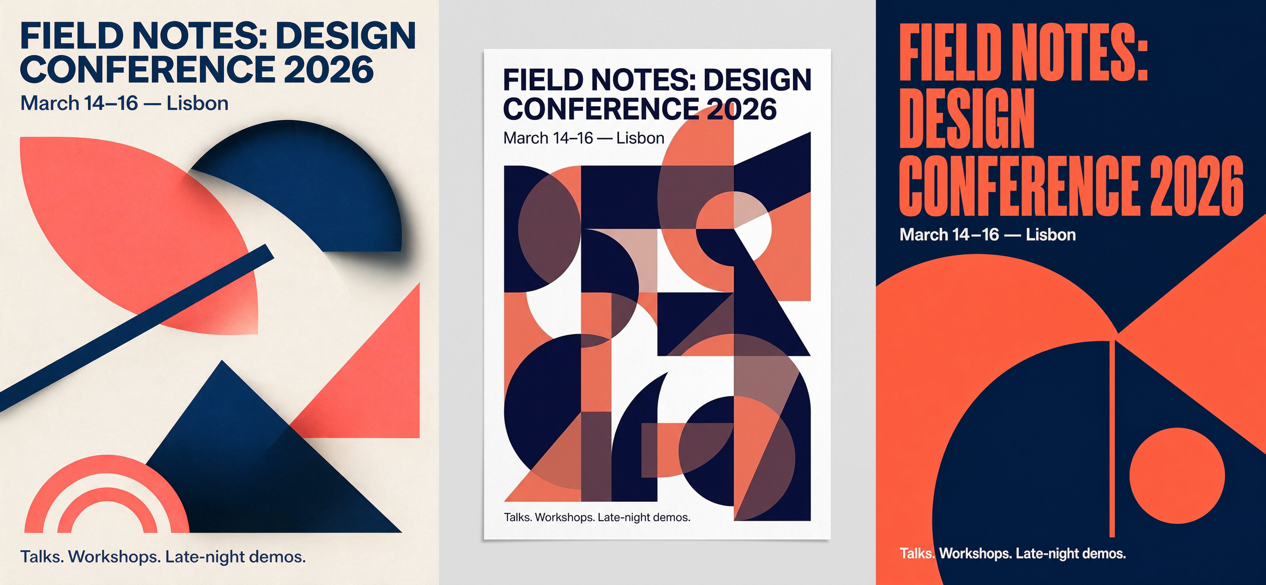
Three separate text blocks at three different sizes in one composition — headline, subheading, and a small body line — stress-tests multi-line native text rendering, not just a single logo word.
UTILITY: seedream        # swap to: nanobanana / gpt_image
MODE: text_to_image
VERSION: v5_pro
IMAGE_SIZE: portrait_4_3

PROMPT: |
  Modern minimalist event poster design, abstract overlapping geometric shapes in coral and
  navy blue, high contrast print-ready composition.
  Render this exact text, nothing else, no extra words:
  Bold headline at top: "FIELD NOTES: DESIGN CONFERENCE 2026"
  Subheading below it, smaller: "March 14–16 — Lisbon"
  Small line of body text near the bottom: "Talks. Workshops. Late-night demos."
  Clean sans-serif typography hierarchy, dense but fully legible layout.

FILE: s2-<model>.png
Read: All three get every word spelled correctly — no garbled letters anywhere, in headline, subhead, or the small bottom line. The difference is composition control: Seedream keeps the geometric shapes clean and separated from the text; Nanobanana lets the shapes overlap into a busier, harder-to-parse middle section; GPT-Image-2 goes boldest with a full-bleed dark background and the largest, most poster-like headline scale.
One gotcha hit during generation: GPT-Image rejects portrait sizes that aren’t divisible by 16 (
1024×1365failed,1024×1536worked) — Seedream and Nanobanana’sportrait_4_3/3:4presets don’t have that restriction.
Scenario 3 — Grounded Reference Edit (same base photo, same instruction)
This is the real differentiator test. All three models get the exact same base photo as IMAGE-INPUT and the exact same edit instruction — add a label, touch nothing else. Fair, apples-to-apples grounded editing.
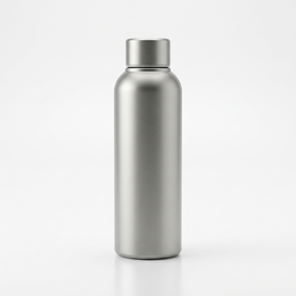
Shared base (generated once, not one of the compared tools):
UTILITY: seedream        # swap to: nanobanana / gpt_image
MODE: edit
VERSION: v5_pro
IMAGE_SIZE: square_hd

PROMPT: |
  Figure 1 is a plain matte stainless steel water bottle on a white studio background.
  Add a wraparound label around the middle third of the bottle: a dark charcoal matte label
  with bold white text "PEAK FLOW" centered on it, and a small minimalist mountain-peak icon
  logo directly above the text. Keep the bottle shape, background, lighting and shadow exactly
  the same — only add the label.

IMAGE-INPUT: prep_bottle.png
FILES: prep_bottle.png
FILE: s3-<model>.png
Read: This is the closest three-way tie of the whole test. All three preserved the bottle shape, background, and lighting untouched and placed a legible “PEAK FLOW” wordmark with a mountain icon exactly where asked. Seedream’s label sits with the most natural label-wrap curvature; Nanobanana renders the sharpest icon edges; GPT-Image-2 keeps the tightest, most centered composition. If you only need clean, literal region-precise edits, any of the three works here — the differences are in the details, not correctness.
Scenario 4 — Mobile App Design, Dark Scheme (investing app, text-to-image, no refs)
The hardest text-rendering test yet: a full fintech portfolio screen with a balance readout, a percentage-change line, chart axis labels, a 5-tab time-range selector, and four holdings rows each carrying a ticker, company name, price, and colored percent badge — over a dozen separate text strings in one dark-mode composition, no reference image.
UTILITY: seedream        # swap to: nanobanana / gpt_image
MODE: text_to_image
VERSION: v5_pro
IMAGE_SIZE: portrait_16_9

PROMPT: |
  High-fidelity mobile app UI design mockup, portfolio screen of an investing/trading app,
  dark mode color scheme: near-black navy background (#0B0E14), electric green accent for
  gains, soft purple secondary accent, clean modern fintech interface, rounded cards with
  subtle glassmorphism, generous spacing, no phone hardware frame — just the app screen itself.

  Top: small "Portfolio" label and a large bold balance readout "$128,450.32" with a smaller
  green line below it reading "+2,340.18 (+1.86%) today".
  Below that: a smooth upward-trending line chart on a dark card with a subtle green gradient
  fill under the curve, and a row of time-range tabs "1D  1W  1M  1Y  ALL" with "1M" selected.
  Below the chart: a "Holdings" section header, then 4 rows, each with a ticker icon, symbol,
  company name, price and a colored percentage badge:
  AAPL  Apple Inc.  $242.10  +1.4%
  TSLA  Tesla Inc.  $318.55  +3.2%
  BTC   Bitcoin     $67,240  -0.8%
  NVDA  Nvidia Corp.  $891.20  +2.1%
  Bottom: a floating rounded bottom navigation bar with 5 icons — Home, Markets, Trade
  (center, highlighted), Wallet, Profile.

  Crisp sans-serif typography, pixel-perfect alignment, native app rendering quality,
  no watermark, no mockup device shadow.

FILE: s4-<model>.png
Read: All three got every single number and ticker exactly right — no hallucinated digits, no garbled tickers, across 4 rows × 4 fields plus the header numbers. That alone would have failed most models a year ago. The split is in UI polish: Seedream renders the flattest, most literal “screenshot” look with the cleanest edge-to-edge card alignment; Nanobanana adds its own art direction — a phone-shaped card frame, neon glow around the center Trade button, and a purple-tinted selected tab that wasn’t asked for, but reads as more “designed”; GPT-Image-2 is the only one that added chart axis labels (
115K–130K, date ticks) unprompted, which is either a nice bonus or scope creep depending on your brief. For a dark fintech dashboard, all three are usable straight out of the prompt — no repair pass needed.
Scenario 5 — ARPG Game Screen Mockup (dark fantasy HUD, text-to-image, no refs)
The most demanding scenario yet: a full rendered action scene (player knight, enemy ogre, torch-lit dungeon) layered under a complete game HUD — health/mana orbs, a 5-slot skill bar with cooldown numbers, a minimap, a quest tracker, and buff/debuff timers. This tests scene composition and UI-over-scene layering at the same time, not just text or a flat UI.
UTILITY: seedream        # swap to: nanobanana / gpt_image
MODE: text_to_image
VERSION: v5_pro
IMAGE_SIZE: landscape_16_9

PROMPT: |
  In-game screenshot mockup of a dark fantasy action-RPG, top-down isometric camera angle,
  gritty painterly art style, moody torch-lit dungeon corridor with fog and embers drifting.

  Center: the player's armored knight mid-swing with a glowing greatsword. Ahead: a large
  ogre-type enemy with a red health bar and name "CINDER BRUTE" beneath it.

  Full HUD overlay:
  - Bottom-left: circular player portrait in a bronze frame, flanked by a red health orb and
    blue mana orb with liquid fill levels.
  - Bottom-center: 5 skill icons in dark-metal frames, cooldown numbers ("3", "7") on two of
    them, gold glow border on the selected skill.
  - Bottom-right: circular minimap with a white player arrow and red enemy dot.
  - Top-left: quest tracker "Quest: The Ember Hollow" / "Defeat the Cinder Brute".
  - Top-right: stacked buff/debuff icons with countdown timer rings.

  Aged bronze and iron UI frames, deep red/amber glow, parchment text panels, crisp readable
  UI text, no watermark.

FILE: s5-<model>.png
Read: All three nail the brief on the first try — armored knight, glowing sword, ogre enemy, and all five HUD regions present and legible, including the two cooldown numbers and the quest text. Seedream’s scene reads the most “in-engine”: cooler lighting, cleanest health/mana orb bevel work, but its skill-bar icons are the least illustrated (flatter, more generic). Nanobanana pushes the moodiest, foggiest atmosphere and the best sword-swing motion trail, at the cost of a slightly smaller, harder-to-read minimap. GPT-Image-2 goes furthest on HUD fidelity — it’s the only one that rendered exact health/mana numbers (“737/1,248”, “412/720”) and a player level badge (“23”) that weren’t explicitly requested, plus swapped the buff timers to countdown clocks instead of rings. For a pitch-deck or marketing mockup, GPT-Image-2’s extra numeric detail reads the most “real”; for a pure art-direction reference, Nanobanana’s atmosphere is the strongest starting point.
One sizing note: GPT-Image’s minimum-pixel-budget floor kicked in here —
1024×576was rejected as too small,1280×720(same 16:9, more pixels) worked.
Scenario 6 — Witch Game Sprite (green screen + MAKE_TRANSPARENT: rembg, text-to-image, no refs)
A classic game-asset workflow: generate the character on a flat chroma-key green background,
then run the shared MAKE_TRANSPARENT: rembg postprocessing flag to strip the background and
ship a clean transparent PNG sprite. The tricky part of this brief on purpose: the witch’s staff
has a glowing green crystal — the same hue as the green-screen backdrop — a classic
green-screen problem for any keying/matting algorithm.
UTILITY: seedream        # swap to: nanobanana / gpt_image
MODE: text_to_image
VERSION: v5_pro
IMAGE_SIZE: square_hd
MAKE_TRANSPARENT: rembg   # same postprocessing flag regardless of which UTILITY generated it

PROMPT: |
  Full-body game character sprite of a witch, neutral idle front-facing pose, arms relaxed,
  centered in frame. Tall pointed black hat with purple ribbon, dark purple/black robe with
  star embroidery, brown leather boots, gnarled wooden staff topped with a glowing green
  crystal. Clean painterly game-asset illustration style, crisp readable silhouette.

  Background: solid flat bright chroma-key green (#00FF00), completely uniform, no gradient,
  no texture — optimized for clean background removal. Soft contact shadow under feet only.

FILE: s6-<model>.png
Read: All three shipped a genuinely usable transparent sprite — same pose, same silhouette, same color story, no background halo bounding-box left behind. But look closely at the edges: all three have a faint green fringe bleeding onto the hair, hat brim, and cloak edges — the classic green-screen “spill” problem, where rembg keys out the flat backdrop but leaves a thin ring of green-tinted pixels where the character’s edge anti-aliased into the background before matting. Nanobanana’s fringe is the most visible (a clear green rim along the cloak silhouette); Seedream and GPT-Image-2 keep it subtler, mostly limited to hair strands. None of the three accidentally erased the glowing green staff crystal, which was the real risk of putting a same-hue prop in the shot — rembg’s segmentation clearly reasoned about “character + held object” as one foreground unit rather than color-keying naively. Style-wise, Seedream and Nanobanana lean anime/painterly, GPT-Image-2 renders a noticeably more detailed, higher-fantasy costume (gold filigree, belt pouches, choker) despite an identical prompt.
Practical takeaway: for production sprite pipelines, treat green-screen prompts as “green background, no green props” — or budget a post-pass (erode-by-1px, or a spill-suppression filter) regardless of which of the three models generated the source art.
Key Learnings
- Same prompt, same call shape, only
UTILITYchanges — Seedream, Nanobanana, and GPT-Image all takePROMPT+FILE; the only per-tool deltas are the sizing fields (IMAGE_SIZEvsASPECT_RATIO/RESOLUTIONvsWIDTH/HEIGHT) andMODE/IMAGE-INPUTfor edits - Run all eighteen in parallel — nothing here depends on a previous result, so all three models × six scenarios fire simultaneously
- Grounded edits need a truly shared base image — generate the neutral starting photo once (outside the comparison), then pass the identical file as
IMAGE-INPUTto all three, otherwise you’re not testing the same thing - GPT-Image enforces
size % 16 == 0— round portrait/landscape dimensions before calling, Seedream/Nanobanana’s preset enums don’t have this constraint - GPT-Image also has a minimum pixel-budget floor —
1024×576was rejected outright as too small even though it’s divisible by 16; bump to a larger same-aspect size (1280×720) when a landscape shot gets rejected - Text rendering is a solved problem for all three now — the real gap is layout discipline (how cleanly shapes stay separated from text), not spelling
- “Keep everything else the exact same” is the load-bearing phrase for edit prompts — drop it and even a good model starts drifting on background/lighting
- Dense UI dashboards no longer break on data accuracy — 4 holdings rows × 4 fields plus header/chart numbers, all three got every ticker and number right; what differs is unprompted art direction (Nanobanana added glow/frame styling, GPT-Image-2 added chart axis labels) — decide if that’s a feature or scope creep for your brief
- Scene + HUD together is still a fair test for all three — a full action scene layered with a 5-region game HUD (orbs, skill bar, minimap, quest tracker, buffs) came back correct and legible from all three models on the first pass; the differentiator is how much extra detail each model volunteers (GPT-Image-2 added numeric health/mana values and a level badge unprompted) — great for polish, but worth flagging in the brief if you need pixel-exact control
MAKE_TRANSPARENT: rembgis a shared postprocessing flag, not a per-model feature — it works identically bolted onto Seedream, Nanobanana, or GPT-Image’s own call (GPT-Image also has a nativeBACKGROUND: transparent, but using rembg everywhere keeps the comparison apples-to-apples); all three still leave a faint green spill-fringe on hair/cloak edges from the green-screen backdrop, so budget a 1px erode or spill-suppression pass for production sprite pipelines no matter which model generated the source art